Harbingers’ Magazine is a weekly online current affairs magazine written and edited by teenagers worldwide.
harbinger | noun
har·bin·ger | \ˈhär-bən-jər\
1. one that initiates a major change: a person or thing that originates or helps open up a new activity, method, or technology; pioneer.
2. something that foreshadows a future event : something that gives an anticipatory sign of what is to come.
We and our partners may store and access personal data such as cookies, device identifiers or other similar technologies on your device and process such data to personalise content and ads, provide social media features and analyse our traffic.
The four-year wait is over and the world’s greatest football extravaganza is finally back.
The FIFA World Cup 2026 will be hosted across 16 cities in North America – 11 in the US, three in Mexico and two in Canada – from 11 June to 19 July.
However, the World Cup doesn’t begin when the whistle is blown. It begins on paper – with the artwork, logos and branding that encapsulate and define the event, and will be seen by millions across the world.
For the first time ever, the tournament is being held across three countries. Traditionally, the event is designed around the hosting country’s culture, but this year’s World Cup’s artistic direction must capture the wide range of distinct cultures and histories of the three countries, and numerous cities, while providing a cohesive design. It’s a massive creative challenge.
Harbingers’ Weekly Brief
Subscribe to the Harbingers’ Weekly Brief, a newsletter written by the editorial board of Harbingers’ Magazine, the world’s youngest newsroom, delivered to your inbox every Monday morning.
The organisation’s most important branding is arguably the logo.At first glance, the logo looks simple, almost understated. Steering away from the more graphic geometric designs of past logos,it uses a clean photograph of the famous World Cup trophy placed in front of the number 26.
Although the logo has received criticismfor its plain looks, the ‘26’ acts like a blank canvas, changing colour and pattern for each city in the tournament, allowing each place to add their own personal touch.
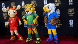
That same spirit is evident in the tournament’s mascots– there are three this year, reflecting the culture of the three countries. Together, they convey the World Cup’s core message of harmony while celebrating individuality.
Maple the Moose, representing Canada, is a goalkeeper who embraces “creativity, resilience and unapologetic individuality”, according to the FIFA website. Striker Zayu the Jaguar reflects Mexico’s vibrant culture and heritage, with “a name inspired by unity, strength, and joy”. Clutch the Bald Eagle is a midfielder who unites people by embracing the wide range of US culture with “boundless curiosity and optimism”.
Beyond the logo and mascot, the tournament’s official promotional posters might be the most visually exciting design element, further representing the tournament’s diverse cultural identity.
For the first time, FIFA hired local artists in each city to create specific posters that capture the city’s personality.
Posters tell a story using famous skylines, landmarks, Indigenous art and animals.
For example, the New York/New Jersey poster features the torch of the Statue of Liberty, a famous symbol for freedom and equality. The Monterrey poster features multiple famous Mexican landmarks (such as the Cerro de la Silla mountains) while incorporating bright colours and geometric designs, such as the calaveras (skulls) from Día de los Muertos, to encapsulate the city’s vibrant culture.
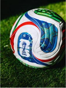
We can’t talk about the tournament’s design without talking about the World Cup ball, one of the most iconic symbols of the sport. Made by Adidas, the ball is called Trionda, which translates to “three waves”.
2026 FIFA World Cup mascots: Canada’s Maple the Moose, Mexico’s Zayu the Jaguar, and the US’s Clutch the Bald Eagle.
The red ‘wave’ filled with maple leaves pays homage to Canada. America’s wave is blue with stars, and Mexico’s wave is green with an eagle on it. They all come together at the centre to form a triangle, representing unity.
Altogether, the brand design team of FIFA and local artists tripled their efforts and it shows. With the adaptable logo, trio of mascots who play as teammates, posters spotlighting each city, and an iconic match ball, World Cup excitement is already building up off the pitch, setting the stage for a tournament that is as special and diverse as the very game itself.
Jennifer Yung-Coak, born in 2009 in Hong Kong, studies in New Hampshire, United States. She joined Harbingers’ Magazine in August 2025 as part of the Japan Newsroom programme, where she began contributing articles to the magazine.
Since then, she has written on topics including architecture, international relations and human rights, while also bringing her enthusiasm for athletics to the newsroom. Her engagement with the magazine led to her appointment as Sport Section Editor for 2026.
Jennifer is interested in design, business and economics, and plans to continue her studies at an American university.
In her free time, she enjoys travelling, drawing and playing sports, and also takes part in volunteer programmes working with children.
🌍 Join the World's Youngest Newsroom—Create a Free Account
Sign up to save your favourite articles, get personalised recommendations, and stay informed about stories that Gen Z worldwide actually care about. Plus, subscribe to our newsletter for the latest stories delivered straight to your inbox. 📲
We use cookies to ensure that we give you the best experience on our website. If you continue to use this site we will assume that you are happy with it.